Write a report for a university lecturer describing the information below
№1
The charts below show the main reasons for study among students of different age groups and the amount of support they received from employers.
Summarise the information by selecting and reporting the main features, and make
comparisons where relevant.
•You should write at least 150 words.
•You should spend about 20 minutes on this task.
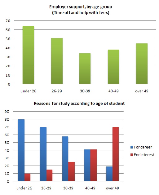
model answer:
The first graph shows that there is a gradual decrease in study for career reasons with age. Nearly 80% of students under 26 years, study for their career. This percentage gradually declines by 10-20% every decade. Only 40% of 40-49yr olds and 18% of over 49yr olds studing for career reasons in late adulthood.
Conversely, the first graph also shows that study stemming from interest increases with age. There are only 10% of under 26yr olds studing out of interest. The percentage increases slowly till the beginning of the fourth decade, and increases dramatically in late adulthood. Nearly same number of 40-49yr olds study for career and interest. However 70% of over 49yr olds study for interest in comparison to 18% studing for career reasons in that age group.
The second graph shows that employer support is maximum (approximately 60%) for the under 26yr students. It drops rapidly to 32% up to the third decade of life, and then increses in late adulthood up to about 44%. It is unclear whether employer support is only for career-focused study, but the highest level is for those students who mainly study for career purposes.
Here is the examiner's comment:
This answer summarises the key features of both charts and integrates them well. Clear trends are identified and supported with appropriately-selected figures. The answer could only be improved by adding an introduction to the general topic of the charts.
The information is well organised, with a clearly-signalled progression. Linking words are used accurately and precisely, although there is occasional omission. Paragraphing is used well initially, but lapses in the later section.
A very good range of vocabulary is used to convey the information concisely and accurately with only occasional inappropriacy. Words are used precisely and there are no errors in spelling or word form.
A wide range of structures is used and most sentences in this answer are accurate. Errors are rare and do not affect communication in this answer.
№2
The graph and table below give information about water use worldwide and water consumption in two different countries.
Summarise the information by selecting and reporting the main features, and make comparisons where relevant.
Write at least 150 words.

model answer:
The graph shows how the amount of water used worldwide changed between 1900 and 2000.
Throughout the century, the largest quantity of water was used for agricultural Purposes, and this increased dramatically from about 500 km³ to around 3,000 km³ in the year 2000. Water used in the industrial and domestic sectors also increased, but consumption was minimal until mid-century. From 1950 onwards, industrial use grew steadily to just over 1,000 km³, while domestic use rose more slowly to only 300 km³, both far below the levels of consumption by agriculture.
The table illustrates the differences in agriculture consumption in some areas of the world by contrasting the amount of irrigated land in Brazil (26,500 km³) with that in the D.R.C. (100 km²). This means that a huge amount of water is used in agriculture in Brazil, and this is reflected in the figures for water consumption per person: 359 m³ compared with only 8 m³ in the Congo. With a population of 176 million, the figures for Brazil indicate how high agriculture water consumption can be in some countries.
№3
The graph below gives information about the preferred leisure activities of Australian children.
Write a report for a university lecturer describing the information shown.
You should write at least 150 words.

model answer:
The graph shows the preferred leisure sctivities of Australian children aged 5-14. As might be expected, it is clear from the data that sedentary pursuits are far more popular nowadays than active ones.
Of the 10,000 children that were interviewed, all the boys and girls stated that they enjoyed watching TV or videos in their spare time. In addition, the second most popular activity, attracting 80% of boys and 60% of girls, was playing electronic or computer games. While girls rated activities such as art and craft highly – just under 60% stated that they enjoyed these in their spare time – only 35% of boys opted for creative pastimes. Bike riding, on the other hand, was almost as popular as electronic games amongst boys and, perhaps surprisingly, almost 60% of girls said that they enjoyed this too. Skateboarding was relatively less popular amongst both boys and girls, although it still attracted 35% of boys and 25% of girls.
(157 words)
№4
The table below provide information on rental charges and salaries in three areas of London.
Write a report for a university lecturer describing the information shown below.
You should write at least 150 words.

model answer:
The table shows two sets of related information: the relative cost, in pounds, of renting a property with one, two or three bedrooms in three different suburbs of London and an indication of the kind of annual salary you would need to be earning to rent in these areas.
Of the three areas mentioned, Notting Hill is the most expensive with weekly rents starting at £375 (salary approximately f 100,000) and rising to £738 per week for a 3-bedroom property. To afford this, you would require a salary in the region of £200,000 per annum. Alternatively, Fulham is the cheapest area shown with rents ranging from £215 per week for a one bedroom property to £600 per week for a 3-bedroom property. To rent in this area, salaries need to be somewhere between £85,000 and £170,000 depending on the number of bedrooms required. For those able to pay in the middle price range for accommodation, Regent's Park might be a more suitable district.
(163 words)
№5
The bar chart below shows the results of a survey conducted by a personnel department at a major company.
The survey was carried out on two groups of workers: those aged from 18-30 and those aged 45-60, and shows factors affecting their work performance.
Write a report for a university lecturer describing the information shown below.
You should write at least 150 words.

model answer:
The bar chart indicates a survey on two different age groups on the factors contributing to make their environment pleasant for working.
These factors are divided into external and internal factors. The internal factors are team spirit, competent boss, respect from colleagues and job satisfaction. The external factors are chance for personal development, job security, promotional prospects and money.
On the internal factors above 50% in both age groups agreed that team spirit, competent boss and job satisfaction are essential to make their environment pleasant. Whereas on the external factors, there are contrasting results. On the
chance for personal development and promotional aspects, 80% to 90% of the younger groups were in favor while only less than 50% of the older group thought so. A similar pattern is also noted on job security. With regards to money, 69% to 70% on both age group said it is essential.
In conclusion, the internal factors have similar responses from the two age groups while they had dissimilar responses on the external factors.
(170 words)
Here is the examiner's comment:
The information contained in the bar chart has been described accurately and concisely and follows a clear progression. There is a clear introduction followed by effective comparisons between the age groups and a valid conclusion. Good formulaic phrases (the bar chart indicates, these factors are divided), although the candidate uses the same language to describe the factors in the bar chart and does not attempt to rephrase them in any way.
№6
The graph below compares the number of visits to two new music sites on the web.
Write a report for a university lecturer describing the information shown below.
You should write at least 150 words.

model answer:
The graph shows people using new music places on the Internet in fifteen days period of time namely personal choice and trendy pop music.
The overall trend shows fluctuation with slight Increased towards the end of the period.
Starting with Music Choice websites; 40,000 people went on this new site on first-day. Half of them backed out the next day. In Contrast to this Pop Parade net sites were visited by 120,000 music lovers on day one which decreased slightly on the next day thereafter regaining the same fame on 3rd day.
After 3rd day the enthusiasm for both music lines on Internet dropped slowly- reaching maximum fall of 40,000 on 7th day. Whereas Music choice gained popularity, slightly Improving to get the original strength of 30,000 viewers on
screen, but was getting still less visiters than their opponent Pop group i.e. 40,000 on day 7.
In the biegining of the next week both gained remarkable recovery after a few fluctuations for 8th and 9th day having 40,000 and 50,000 visiters respectively, reaching to their peaks of one and a half thousand new viewers for Pop Parade on 11th day showing a contrast of very few people visiting Music choice for the same day. Thereafter Music choice gained popularity on 12th day for having more than 120,000 new visiters on web.
In the end of the period Pop sites were visited by maximum viewers of 180,000 whereas sites located to Music choice were not explored by more than 80,000 explorers on the last day of the report.
Here is the examiner's comment:
Well organized with some good linking devices and collocations (gain popularity, remarkable recovery, decrease slightly) and some valid comparison of the music sites. However, some sentences are long and confusing (paragraph 5), some collocations are inaccurate (slight increased, reaching to their peaks) and there is some repetition (7th day, 3rd day, 11 th day). Some words are spelt incorrectly (poeple, Improoving, visiters,begining).
№7
The table below shows the proportion of different categories of families living in poverty in Australia in 1999.
Summarise the information by selecting and reporting the main features, and make comparisons where relevant.
You should write at least 150 words.
Give reasons for your answer and include any relevant examples from your own knowledge or experience.

Model answer
The table gives a breakdown of the different type of family who were living in poverty in Australia in 1999.
On average, 11% of all households, comprising almost two million people, were in this position. However, those consisting of only one parent or a single adult had almost doubt this proportion of poor people, with 21% and 19% respectively.
Couples generally tended to be better off, with lower poverty levels for couples without children (7%) than those with children (12%). It is noticeable that for both types of household with children, a higher than average proportion were living in poverty at this time.
Older people were generally less likely to be poor, though once again the trend favoured eldery couples (only 4%) rather than single eldery people (6%). Overall the table suggests that households of single adults and those with children were more likely to be living in poverty than those consisting of couples.
(154 words)
№8
The charts below show the percentage of their food budget the average family spent on restaurant meals in different years. The graph shows the number of meals eaten in fast food restaurants and sit-down restaurants.
You should write at least 150 words.
Give reasons for your answer and include any relevant examples from your own knowledge or experience.

model answer:
Over the past 30 years, the average family has dramatically increased the number of meals that they eat at restaurants. The percentage of the family's food budget spent on restaurant meals steadily climbed. Just 10 percent of the food budget was spent on restaurant meals in 1970, and 15 percent in 1980. That percentage more than doubled in 1990, to 35 percent, and rose again in 2000 to 50 percent. Where families eat their restaurant meals also changed during that 30-year period. In 1970, families ate the same number of meals at fast food and sit-down restaurants. In 1980, families ate slightly more frequently at sit-down restaurants. However, since 1990, fast food restaurants serve more meals to the families than do the sit-down restaurants. Most of the restaurant meals from 2000 were eaten at fast food restaurants. If this pattern continues, eventually the number of meals that families eat at fast food restaurants could double the number of meals they eat at sit-down restaurants.
(164 words)
№9
The map below is of the town of Garlsdon. A new supermarket (S) is planned for the town. The map shows two possible sites for the supermarket.
Summarise the information by selecting and reporting the main features, and make comparisons where relevant.
You should write at least 150 words.
Give reasons for your answer and include any relevant examples from your own knowledge or experience.

model answer:
The first potential location (S1) is outside the town itself, and is sited just off the main road to the town of Hindon, lying 12 kms to the north-west. This site is in the countryside and so would be able to accommodate a lot of car parking. This would make it accessable to shoppers from both Hindon and Garlsdon who could travel by car. As it is also close to the railway line linking the who towns to Cransdon (25 km to the south-east), a potentially large number of shoppers would also be able to travel by train.
In contrast, the suggested location, S2, is right in the town centre, which would be good for local residents. Theorically the store could be accessed by road or rail from the surrounding towns, including Bransdon, but as the central area is a no-traffic zone, cars would be unable to park and access would be difficult.
Overall, neither site is appropriate for all the towns, but for customers in Cransdon, Hindon and Garlsdon, the out-of- town site (S1) would probably offer more advantages.
(179 words)
№10
The table below shows the sales at a small restaurant in a downtown business district.
Summarize the information by selecting and reporting the main features, and make comparisons where relevant.
You should write at least 150 words.
Give reasons for your answer and include any relevant examples from your own knowledge or experience.

model answer:
The sales at this small restaurant during the week of October 7 to 13th followed a fairly set pattern from Monday to Friday, and then showed notable shift on the weekend. The lunch and dinner sales during the week peaked on Friday and then dipper down as the weekend set in.
During the week of October 7-14th, the lunch sales averaged at approximately $2,400. The highest lunch sales occurred on Friday, and the lowest occurred on Sunday. Sunday's lunch sales were approximately $1,000 less than the average lunch sales during the rest of the week.
Dinner sales, which generated at least $1,000 to $1,500 more a day than lunch sales, also remained steady during the week. Just like the lunch sales, the dinner sales peak on Friday and dipped down for the weekend.
Excluding Wednesday and Thursday, the lunch and dinner sales from October 7-11 rose gradually until the end of the business week. Midweek, on Wednesday and Thursday, the sales were slightly lower than they were on Tuesday.
According to the sales report, this restaurant has a steady lunch and dinner crowd. The most profitable day during the second week of October was Friday. Sunday, was the least profitable day, with the full day's sales totaling/totalling
less than the Friday dinner sales. These numbers are reflective of a restaurant that is located in a business/financial district where business hours are Monday through Friday.
№11
In June 1996, an experimental flu vaccine was trialled in a large country town on females only.
Summarise the information by selecting and reporting the main features, and make comparisons where relevant.
You should write at least 150 words.
Give reasons for your answer and include any relevant examples from your own knowledge or experience.

model answer:
The diagrams show data for a flu epidemic which hit a large country town in 1996. Figure 1 gives the number of persons who died; Figure 2 shows the percentage breakdown of females who received a new flu vaccine; and Figure 3 gives the number of cases of flu before and during the epidemic.
In Figure 1 it can be seen that the flu was responsible for the deaths of 2 females but no males in the period from March to May. However, from June to August, there were 4 female deaths and 1 male death.
According to the pie chart in Figure 2, only those females most at risk were given the new flu vaccine; 28% did not take part in the trial. Of those females who took part, 35% were aged (over 65 years old); 24% were babies or children; and 13% were either hospitalised or receiving other medical attention.
From Figure 3 it is clear that the new vaccine had a positive effect on the number of new cases of flu reported in females. There were just over 1000 cases reported in March, climbing rapidly to a peak of 3500 in June. Thereafter, the number of cases dropped slowly to about 2800 in August, before levelling off at 2500 for the rest of the year. For males, the figures were lower but showed a similar trend throughout the epidemic.
№11
The chart below shows estimated world literacy rates by region and by gender for the year 2000.
Write a report for a university lecturer describing the information below.
You should write at least 150 words.

model answer:
In this report I will describe a bar chart that shows the estimated world illiteracy rates by gender and region for the year 2000.
First I will look at male illiteracy for the 6 areas shown. The lowest rates were in Developed Countries, Latin America/Caribbean and East Asia/Oceania with rates of 1% (approximately), 10% and 8% (approximately) respectively. The rates for the next three areas were much higher and quite similar to each other. Sub-Saharan Africa, the Arab States and South Asia had rates of approximately 31%, 29% and 34%.
Female illiteracy was much higher relatively in each area except Latin America/Caribbean where it was only slightly higher. The lowest rates for female illiteracy were again Developed Countries, Latin America/Caribbean and East
Asia/Oceania with rates of approximately 2%, 12% and 20%. Again the rates for the next three areas were much higher and quite similar to each other. Sub-Saharan Africa, the Arab States and South Asia had rates of approximately 48%, 52% and 56%. This ends my report.
№12
The chart shows the number of mobile phones and landlines per 100 people in selected countries.
Write a report for a university lecturer describing the information given.
You should write at least 150 words.

model answer:
The graph shows the number of mobile phones and landlines per 100 users, for selected countries. Overall, most of the countries included in the graph have more mobile phones subscribers than landlines.
Most European countries have high mobile phone use. The biggest users of mobile phones are the Italians, with 88 cell phones per 100 people. For example, Italy has twice as many mobile phones as landlines, with 88 mobiles per hundred people compared to 45 for landlines. Mobile phone use is low in Canada, with fewer than 40 phones per 100 people. Denmark is also unusual because it has slightly more landlines than mobile phones.
However, in some countries, the number of landlines is higher than the number of mobile phones. One example is the USA, where the number of mobiles, at 50 per 100 people, is much lower than the number of landlines, at almost 70 per hundred. A similar pattern can be seen in Canada. The highest number of landlines in the graph is in Denmark, with about 90 per 100 people. In contrast, the lowest figures for fixed lines are in Italy and the UK. In conclusion, it seems that mobile phone use is higher in Europe than in North America.
№13
The graphs show enrolment in different colleges in the Higher Colleges of Technology in 1999.
Write a total of 150 - 200 words about the information in the three graphs.
Write a report for a university lecturer describing the information given.
You should write at least 150 words.

model answer:
The charts shows student enrolment by gender and level in different colleges of the Higher Colleges of Technology colleges in the UAE.
There are clear differences in male and female enrolment. Females outnumber men in all the colleges, with almost 25% more students in Dubai Women's college than in Dubai Men's. Ras Al-Khaimah Women's College has almost 180 students, compared to only 100 in the Men's college.
Females also outnumber males by level, with almost double the number of men at Higher Diploma level (330 compared to 181). Only at Diploma level does the number of men slightly exceed that of women.
Over half the students are in Certificate level, with less than a quarter at Higher Diploma or Bachelor level.
In conclusion, most students in the Higher Colleges are enrolled at Diploma level or below, and the majority of students are women.
(143 words)
№14
The graph above show information of employment rates across 6 countries in 1995 and 2005.
Summarize the information by choosing and describe the main idea, and make comparisons where appropriate.
You should write at least 150 words.

model answer:
The graph shows changes in employment rates in six countries between 1995 and 2005, for men and women. Overall more and more people of working age are employed, and there have been significant improvements for women, although they leg behind men in entering the workforce.
The most obvious trend in the graph is that women have lower employment rates in most of the countries in the graph. For example, in Australia in 1995, 57 percent of men could find work or retain a job, but only 27 percent of women. The difference was even bigger in New Zealand, with 60 percent of women. Even in Switzerland and Iceland, alightly more men than women were in the job market.
The second biggest trend in the graph is the improvement in employment between 1995 and 2005. In all countries shown, figures for both men and women improved. The biggest change was in the United Kingdom, from 55 percent of men in 1995 to 73 percent over the ten years period.
Furthermore, the increases in employment rates for women were much higher in New Zealand. The percentage of working women jumped from 25 percent to 42 percent, and in the United States from 45 percent to 61 percent over the decade.
In conclusion, all the countries in the graph showed at least a 12 percent increase in employment rates of both men and women over the ten yeares. While men had relatively higher employment rate throughout the period, more and more women appear to be entering the labour market.
№15
The line graph below gives information on cinema attendance in the UK.
Write a report for a university lecturer describing the information given.
You should write at least 150 words.

model answer:
The given line graph illustrates information on the percentage of people who went to the movies in the United Kingdom between 1990 and 2010. The people's attendance is divided into four different age groups.
Overall, younger people seemed to, and are predicted to, be more active in movie going than their older counterparts. However, all four age groups showed a gradual increase in attendance numbers during the given period, except for a slight drop between 1995 and 2000.
To be specific, a larger percentage of people between the ages of 24 and 34 went to, and are expected to, go to the cinema than those in any other age group. Approximately 51% of the respondents from this age group are expected to attend movies in 2010 compared with only 38% in 1990. Even in the group that had the smallest number of movie goers, those between the ages of 44 and 54, there was an increase of 6% in their attendance. (161 words)
№16
The chart below shows the amount spent on six consumer goods in four European
countries.
Write a report for a university lecturer describing the information shown below.
You should write at least 150 words.
•You should spend about 20 minutes on this task.

model answer:
The chart shows that Britain, among the four European countries listed, has spent most heavily on the range of consumer goods included. In every case, British spending is considerably higher than that of other countries; only in the case of tennis racquets does another country, Italy, come close.
In contrast, Germany is generally the lowest spender. This Is most evident in photographic film, where Germany spends much less than Britain. Germany only spends more than another country, France, in two cases; tennis racquets and perfumes.
Meanwhile, France and Italy generally maintain middle positions, averaging approximately similar spending overall. Specifically, France spends more on CDs and photographic film but less on tennis racquets than Italy does. Italys spending on personal stereos is only marginally greater than that of France, while spending on toys is equal between the two.
It is clear from the data given that there are some significant differences in spending habits within Europe.
№17
Write a report for a university lecturer describing the information below.
•You should write at least 150 words.
•You should spend about 20 minutes on this task.

model answer:
The pie charts show changes in American spending patterns between 1966 and 1996.
Food and cars made up the two biggest items of expenditure in both years. Together they comprised over half of household spending. Food accounted for 44% of spending in 1966, but this dropped by two thirds to 14% in 1996. However, the outlay on cars doubled, rising from 23% in 1966 to 45% in 1996.
Other areas changed significantly. Spending on eating out doubled, climbing from 7% to 14%. The proportion of salary spent on computers increased dramatically, up from 1% in 1996 to 10% in 1996. However, as computer expenditure rose, the percentage of outlay on books plunged from 6% to 1%.
Some areas remained relatively unchanged. Americans spent approximately the same amount of salary on petrol and furniture in both years.
In conclusion, increased amounts spent on cars, computers, and eating out were made up for by drops in expenditure on food and books.
№18
Write a report for a university lecturer describing the information below.
•You should write at least 150 words.
•You should spend about 20 minutes on this task.

model answer:
The graph shows weekly expenditure on fast food in Britain by food and income group. There are two main trends. First, the expenditure is directly related to income. Secondly, there are differences in the types of fast food eaten by each group.
The amount of money spent on fast food is related to income. People in the high-income group spent the most - over 85 pence per person per week. People in the low-income group spent the least - less than half of what the high-income earners spent.
The type of fast food eaten also depends on the group. High-income earners spent 3 times more on hamburgers than people in the low-income group. Pizza was generally the least favorite food. Fish and chips was the most popular food with the low-income group but consumption was fairly similar among all groups.
№19
Write a report for a university lecturer describing the information below.
• You should write at least 150 words.
• You should spend about 20 minutes on this task.

model answer:
The graphs show health and education spending and changes in life expectancy and infant mortality in the UAE.
Overall, as the percentage spent on health and education increases, infant mortality and life expectancy improve.
Graph 1 shows the percentage of GDP spent on health and education between 1985 and 1993. There were big increases in both areas. Health spending stood at about 8% in 1985 but rose to 9% in 1990 and 10% in 1993.
Spending on education was even higher. It was 10% in 1985, and shot up to 14% in 1990 and 15% in 1993, a 50% increase in just 8 years.
Graph 2 shows improvements in life expectancy and infant mortality between 1970 and 1992. Life expectancy was just 60 in 1970 but rose to almost 72 in 1992. In contrast, the number of babies dying dropped dramatically, from 60 per 1000 in 1970 to only 22 in 1992.
In conclusion, people in the UAE are living longer and healthier lives because of the government's spending on education and medical facilities.